Redesigning a Fintech Product at KongaPay
KongaPay is a safe and secure method of online payment. Pay for items & TV Subscriptions, Send & Receive Money, Buy Airtime, No Hidden Charges. This project is about revamping the whole system ( Webpage, Web app, Mobile web app & Mobile app), giving it a better User experience, introducing new features based on the user demand.
Role
Lead UI/UX Designer
Industry
FinTech
Duration
6 months

Overview
KongaPay is a safe and secure method of online payment. Pay for items & TV Subscriptions, Send & Receive Money, Buy Airtime, No Hidden Charges.
This project is about revamping the whole system ( Webpage, Web app, Mobile web app & Mobile app), giving it a better User experience, introducing new features based on the user demand.
Problem Statement
KongaPay was firstly built for the use of the company, with the need to introduce it publicly, there comes the need to update the designs to give it a modern look while also introducing new features that are important to the users and identifying & fixing several pain points the users have using the existing system.
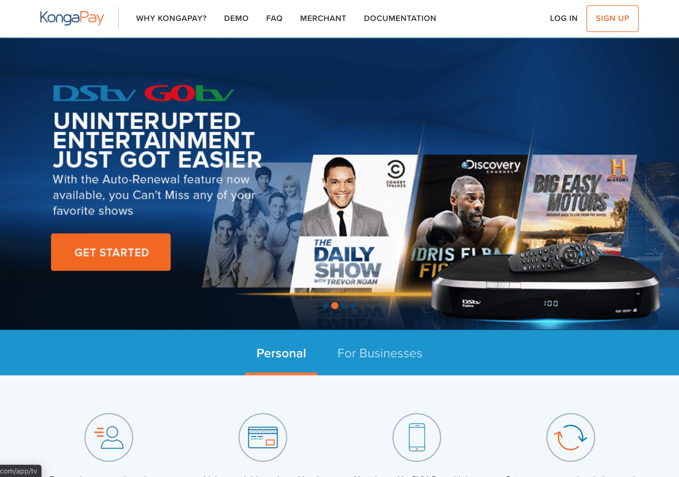
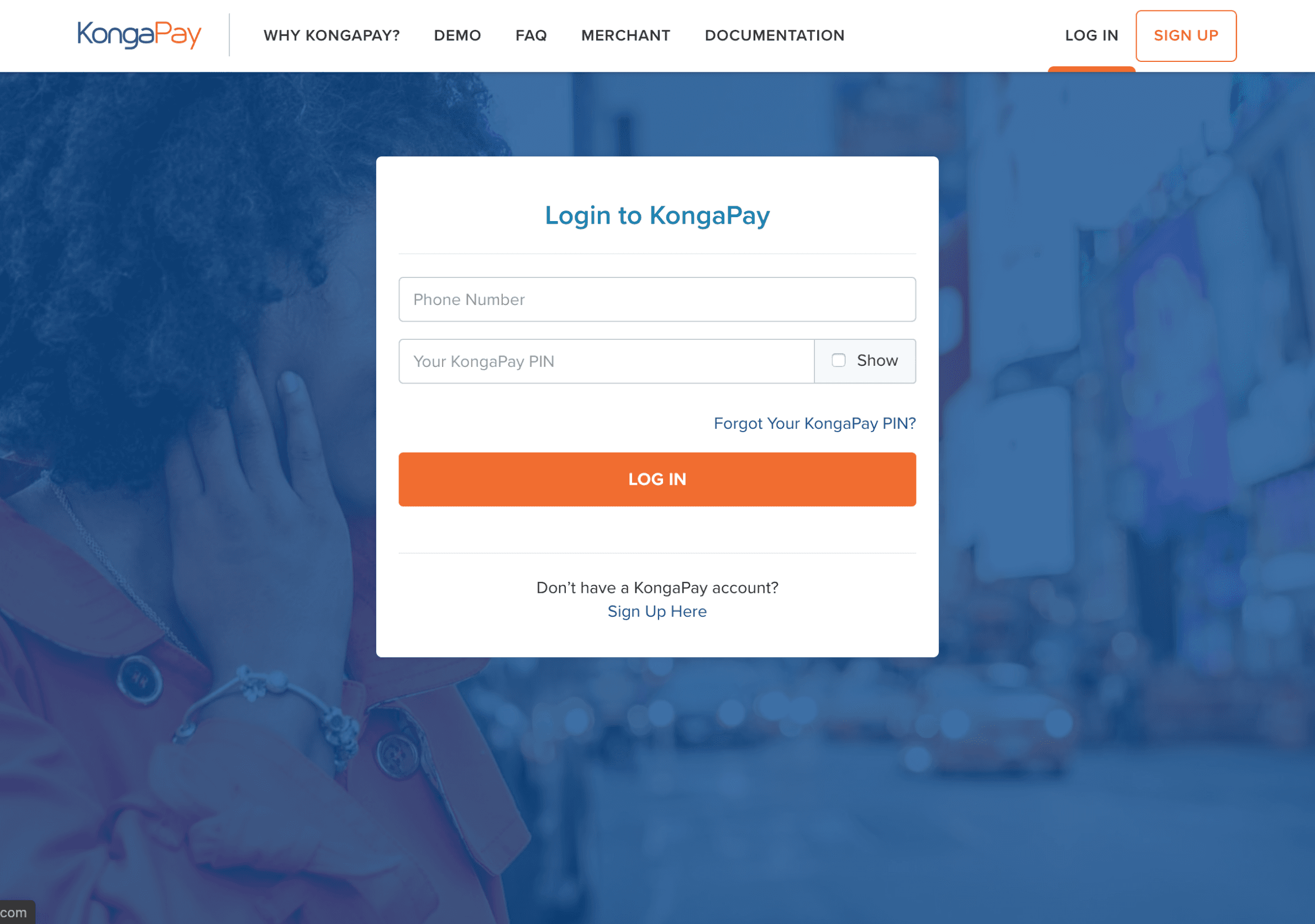
So we had to start the project from scratch since they had plans to introduce new features and products to the system. Here are some of the screens from the current system.

User Research
The KongaPay Team on interacting with the products notice a lot of drop-offs of users when using the product, after registration, and before completing their activities.
I needed to discover who were the major users of the product and the major need they use the product for. In order to do so, I created a user survey to better understand who my users are and what they are trying to do.
User Survey
The link to the survey is available here.
A key insight from our screening survey was how many of the users make use of financial apps and how often they make use of the product.
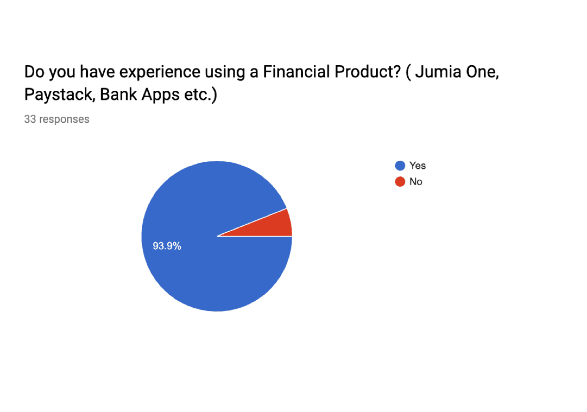

Results also supported our choice of the platform with 53% of users on the Andriod app, 42% of users on Website application while IOS was around 4%. Results also highlighted that the major use of the product was, For transfers, as payment for merchants, Bill payment, with 28% of users using it mainly for transfers.
User Interview
To get more valuable user research insights, I had a one on one interview with about 5 users gotten from the survey who was a genuine fit for our target users. My goal at this stage was to get detailed information on the pain points each user encounters using the current system to discover areas of friction that we could improve on. and also other needs the product can help them to solve.
Here are the key pain points and insights I gathered from the interviews:
Users found it stressful having to provide OTP for every transaction.
The flow for merchant payment required entering the full Merchant ID which they found as a pain point
Users found the flow of transactions too long.
The need to log in for every recurring transaction.
The lack of a beneficiary list for faster flow.
Ideation
Finally, after I found out the pain points to work on and I started a brainstorming exercise to identify the better way to provide a solution to the issues the users were encountering and had pointed out during the interviewing processes. My ideas were:
Introduce fingerprint authentication for login and transaction processes.
Quick use feature on the application.
Ability to save beneficiary and common transactions performed.
Auto detect OTP for Mobile.
Introduction of Transaction PIN in place of OTP in case of failures.
I had a meeting with the team on the project to go through my findings with them and recommended solutions to ensure everyone was on board with it including the developers.
Design Solution
The high fidelity designs for the products was done with FIGMA.
WEB APPLICATION
User Testing, Feedback & Iteration
The project was a career-defining one, I’m pleased with the outcomes. The journey was also a major learning point for me. One of the key part of the process was interacting with the users and not realying on my intuition.
Project Learning
The project was a career-defining one, I’m pleased with the outcomes. The journey was also a major learning point for me. One of the key parts of the process was interacting with the users and not relying on my intuition.
I also had to be able to properly relay my ideas and plan with the team and to take not only the PM but also the developers along my design process. These had a huge impact on the product.
The product is currently in the development stages so not all the design pages were included in this case study, The product will soon become available to the public for usage.
Other projects

Eazipay
A Simple Payment Solution for Small Businesses

Designing the Study Experience for Nursing Exams
Boardly is an AI-powered exam prep platform that helps nursing students prepare for board-style exams such as NCLEX-RN, NCLEX-PN, and APRN specialty certifications.

Mobile Design for The Ultimate Football and Cricket App
The Ultimate Football and Cricket App is a mobile sports platform that brings real-time match updates, statistics, analysis, and fan engagement to football and cricket lovers worldwide

Collection of Landing Pages

A Discount Shopping Application
ABiT is a pan-African company focused on exploiting creative opportunities of technology in the African regions.

The Fastest Way to pay Your Global Tech Team

iSchools
Revamped iSchools' learning platform with gamification and accessibility enhancements, resulting in a 59% increase in user growth and a 46% rise in revenue.